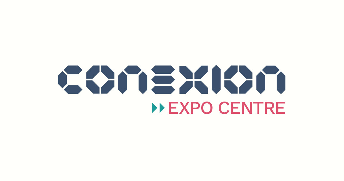
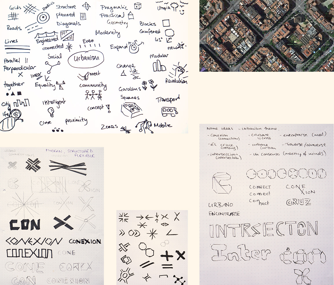
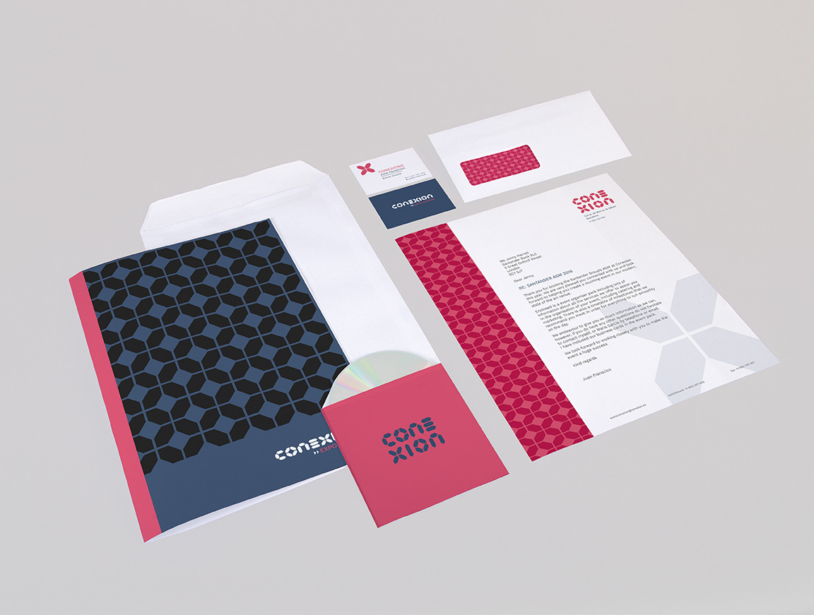
Inspiration for the Conexion logo is taken from urbanism, which Barcelona pioneered in the early 19th century. Like urban design, Conexion seeks to bring people together both socially and for business. The shapes of the letters reflect the octagonal city blocks and the converging roads. The logo has several varieties including stacked and a logo mark.
The Conexion logo provides useful elements to be used in the brand's other identity assets, such as stationary, wayfinding and other environmental graphics. The corporate colours chosen seek to be flexible and bring together the corporate and leisure elements of Conexion's product offering, without putting emphasis on either business segment and alienating customers / clients.
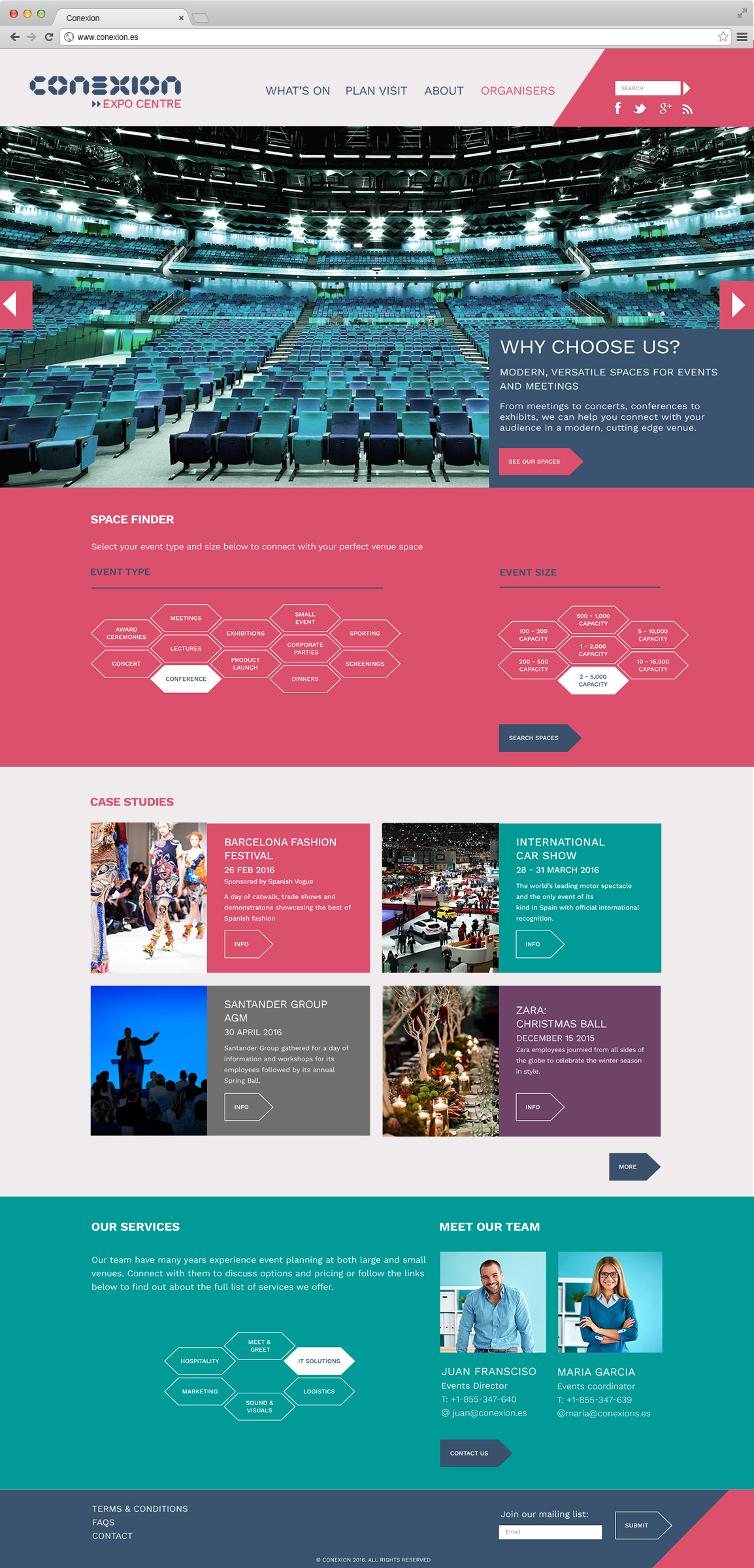
The section of Conexion's corporate website aimed at event organisers seeks to provide potential users with relevant information about the the spaces available, examples of the events Conexion has already hosted and the additional services that can be provided. As event planning can be quite in depth, the booking would be performed through contact with one of the events team.